UX DESIGN TEAM:
Erik Soriano
Jiexuan Zhang
MY ROLE:
UX Research
Data Analysis
UI Redesign
TIMELINE:
2 Week Sprint
Spring 2022
EQUIPMENT USED:
Optimal Workshop
Microsoft PowerPoint
Adobe Indesign
Figma
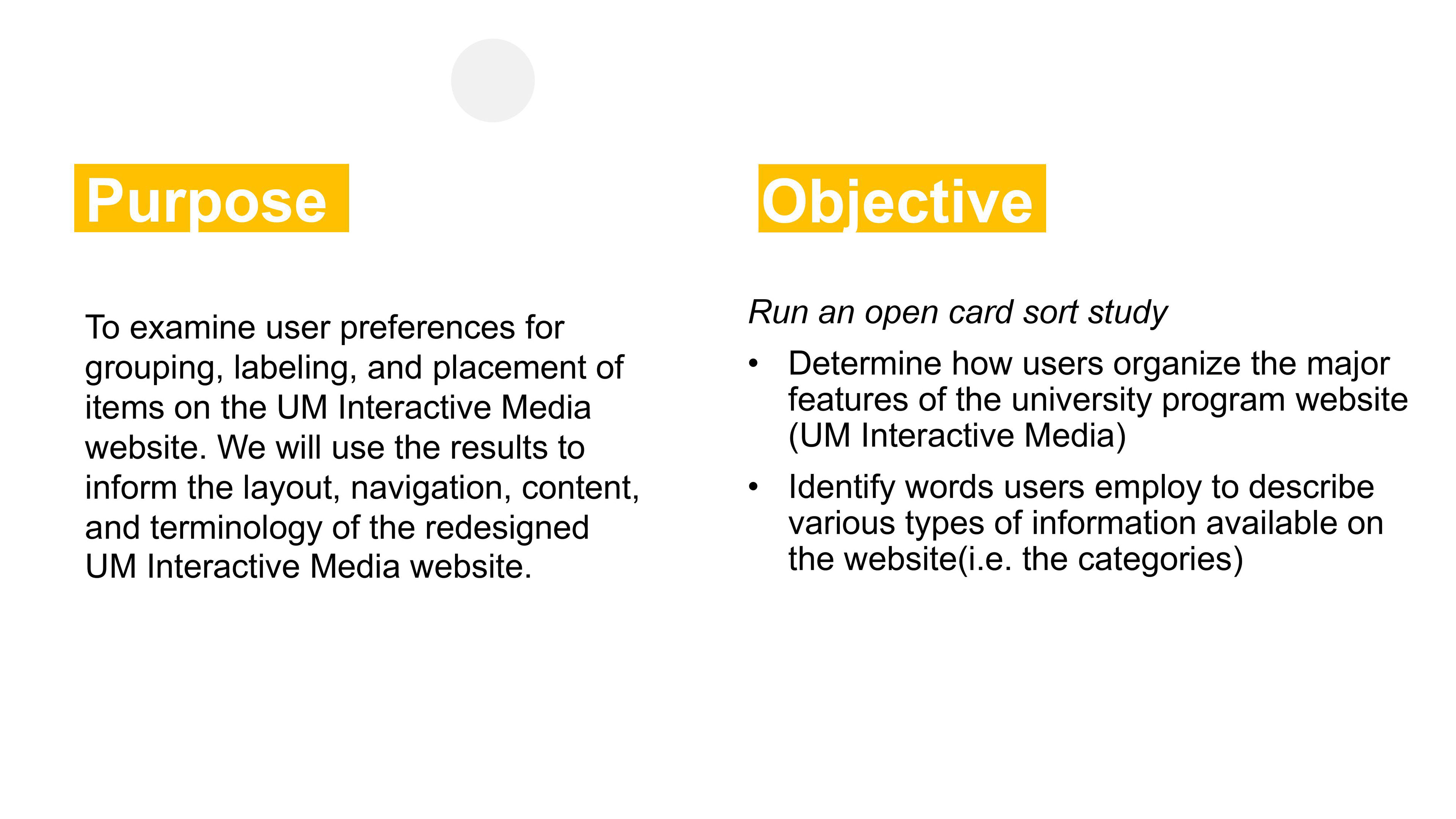
Introduction
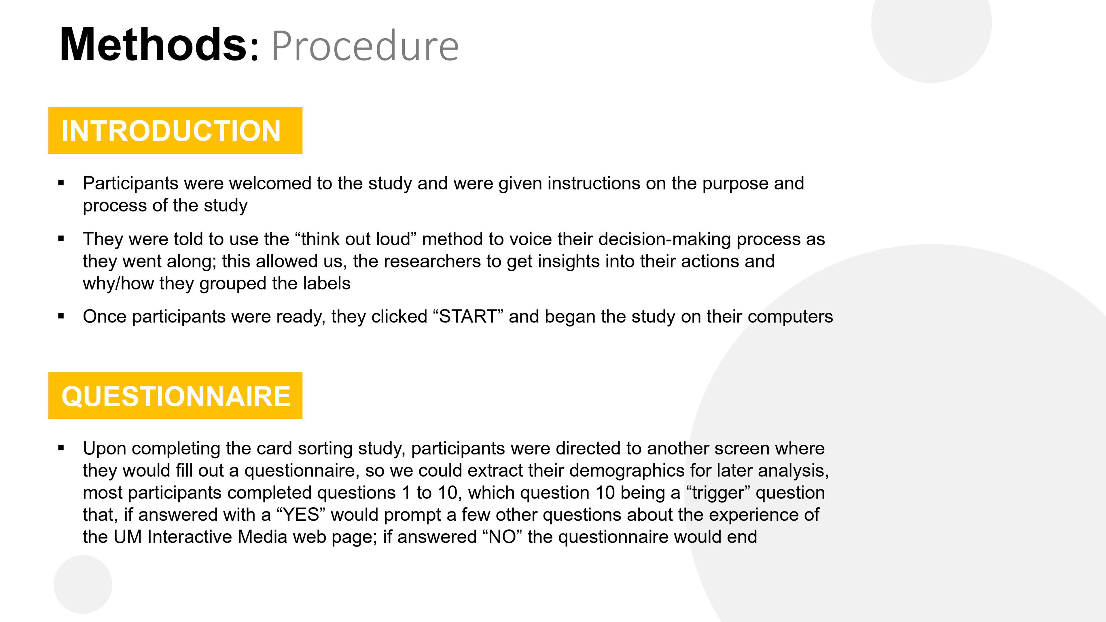
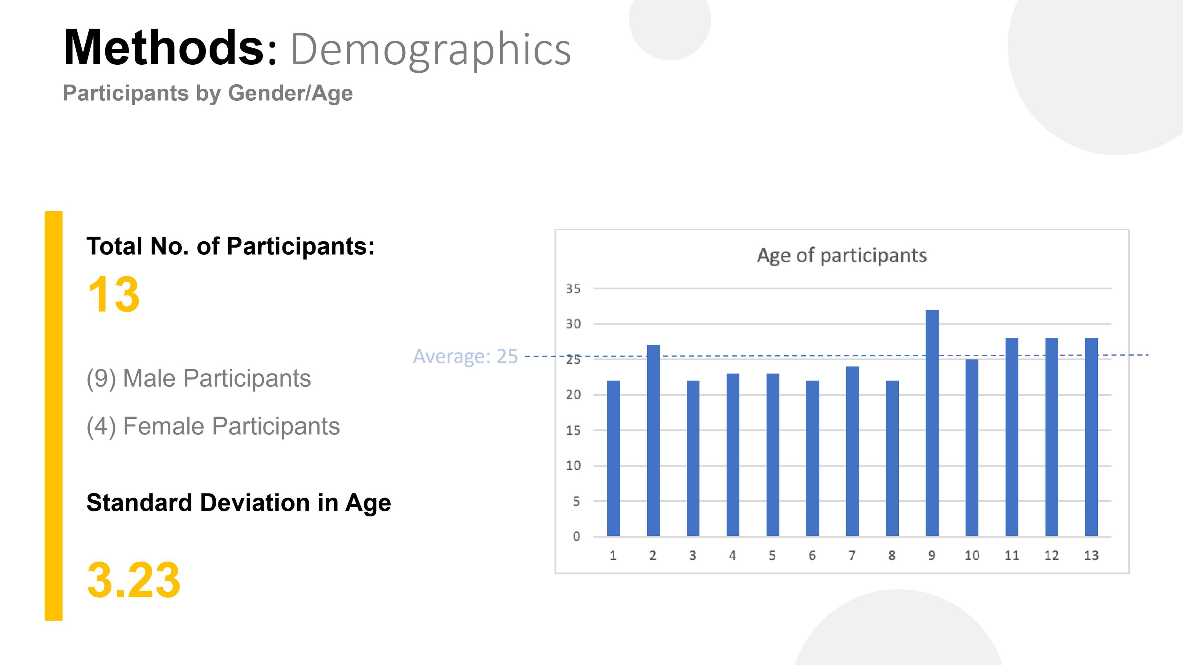
Our research team conducted a study with 13 participants to learn and analyze their behavior of organizing information of a web page. Participants were instructed on creating groups using the 43 different labels they were given. The labels were related to the navigation of the UM interactive website.
Participants were also advised to name the groups as they went along, but they were not told which website these labels belonged to. While there was no time limit, they were advised to complete the study as hastily as possible. Each session was conducted individually and remotely, while being moderated by a researcher.
Our findings and analysis of the data collected herein, helped us come up with a redesign for the current UM Interactive Media home page. This report details our findings during this digital open card sorting study.
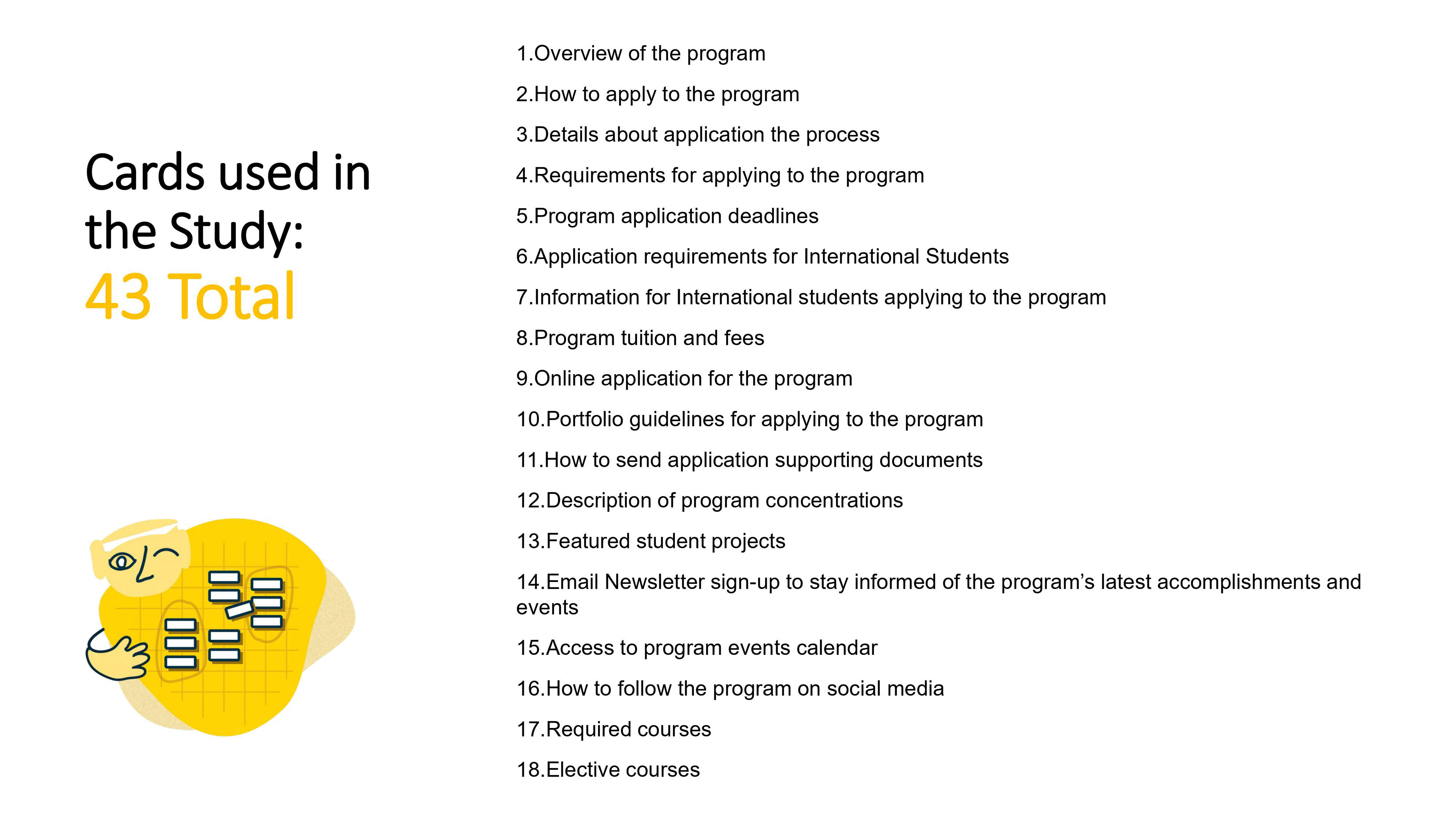
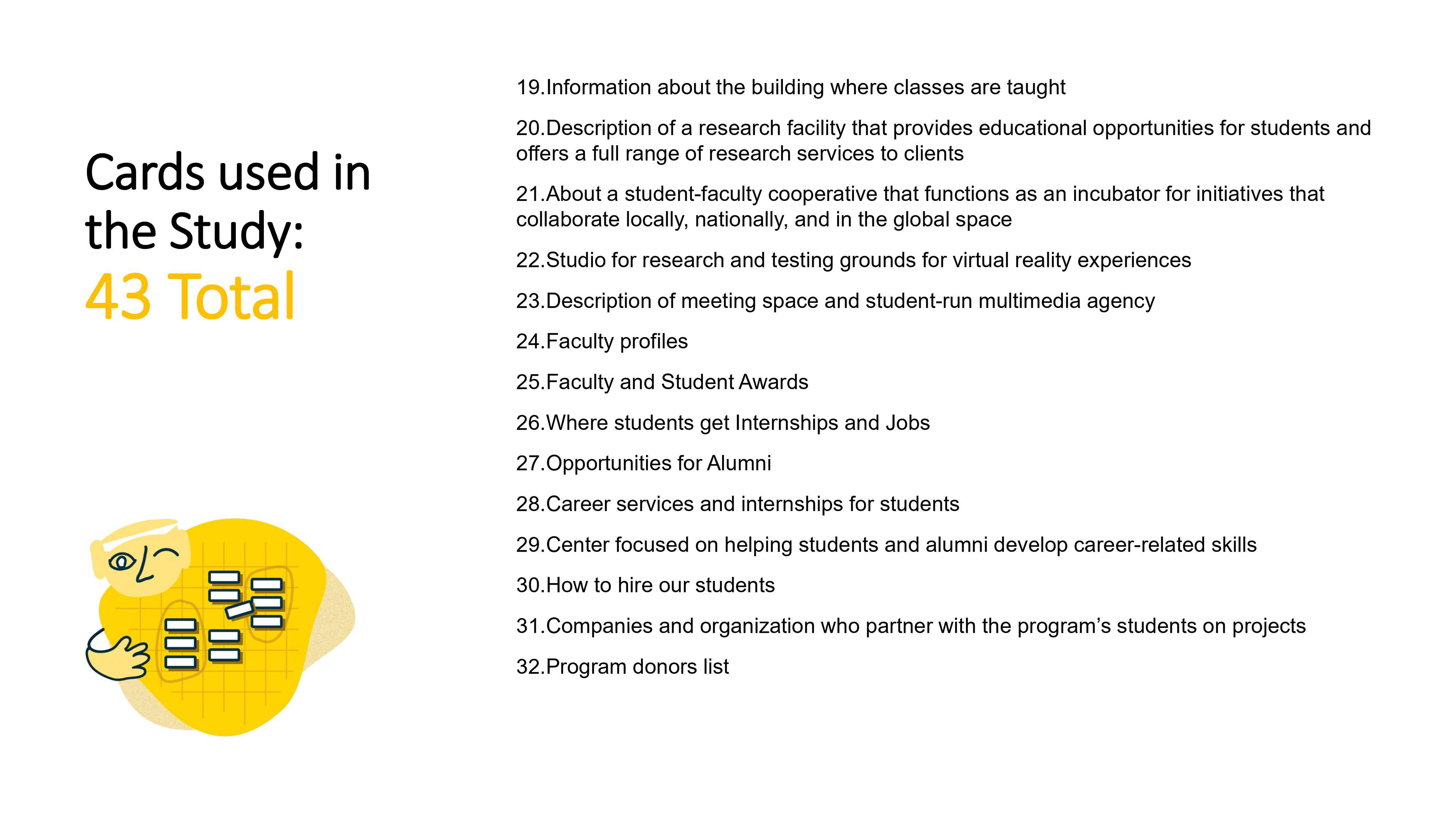
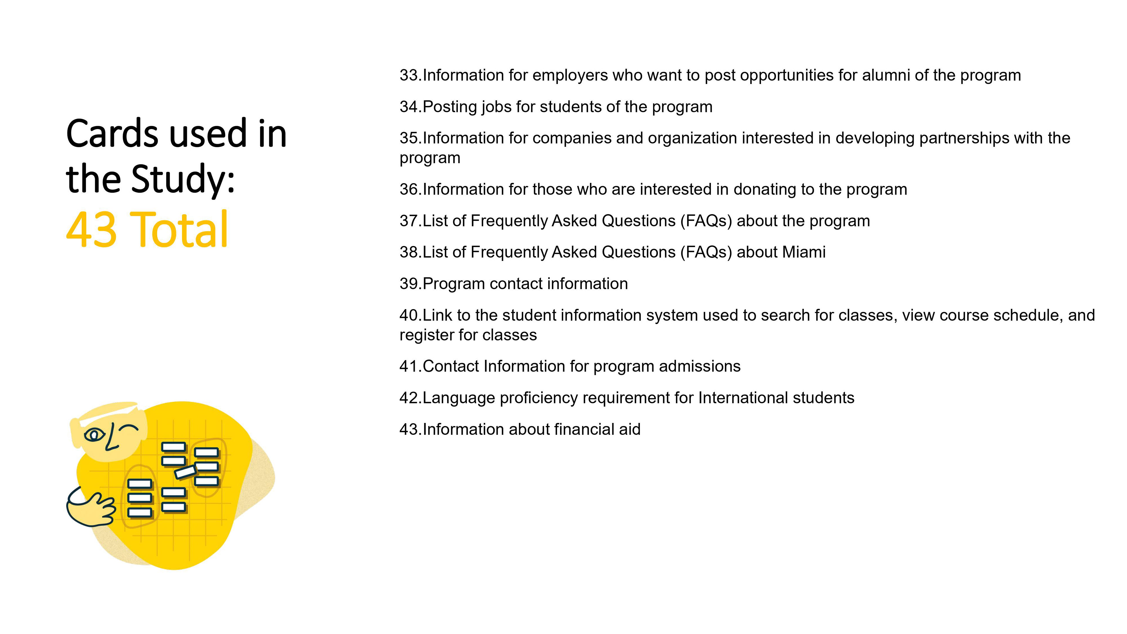
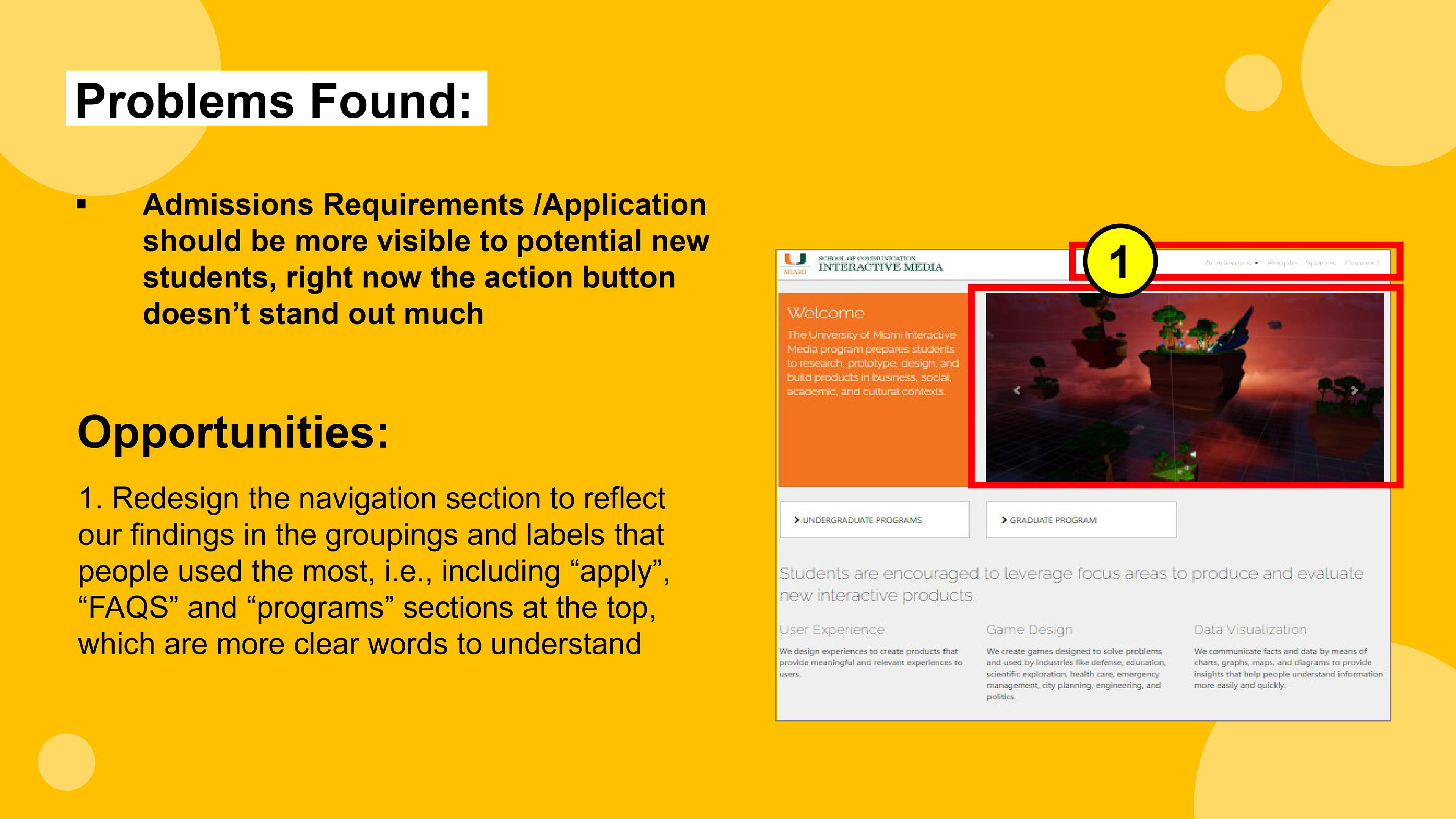
We used a total of forty three (43) cards for the study, you can see the complete list in the images below. All cards were related to the navigation of the UM Interactive Media homepage, and users were allowed to sort them in any order they wished. Our team later on analyzed the groupings the participants made, and also looked carefully at the time each person took to complete the sorting session; this was imperative in understanding how intuitive the names of all the navigation items, as it is best practice to use terms and labels that everyone is familiar with, regardless of their knowledge of the University of Miami website.
We also discovered a standard deviation of 3.23 among the ages of all the participants; we included participants from various parts of the world, and different academic levels, to understand how intuitive the current navigation is. As stated earlier, it is best practice to make sure the user interface communicates the same language as the user, which is one of the heuristics used in usability testing created by Jakob Nielsen (see this link for reference), this ensures the user experience of the website is usable and useful.
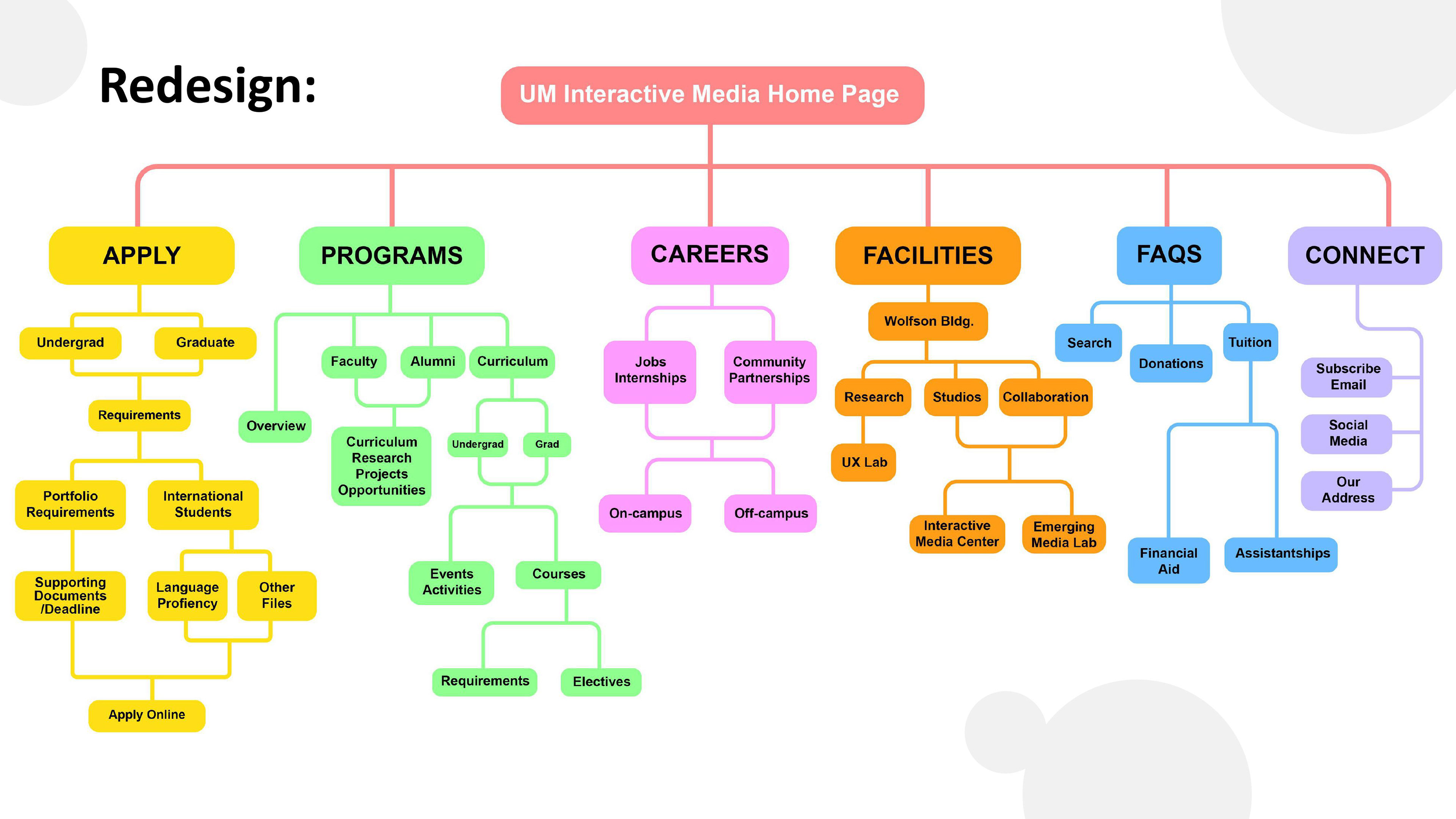
Site Map based on our findings and analysis of participant data. We used this site map as a guide for the redesign of the UM Interactive Media Home Page redesign.
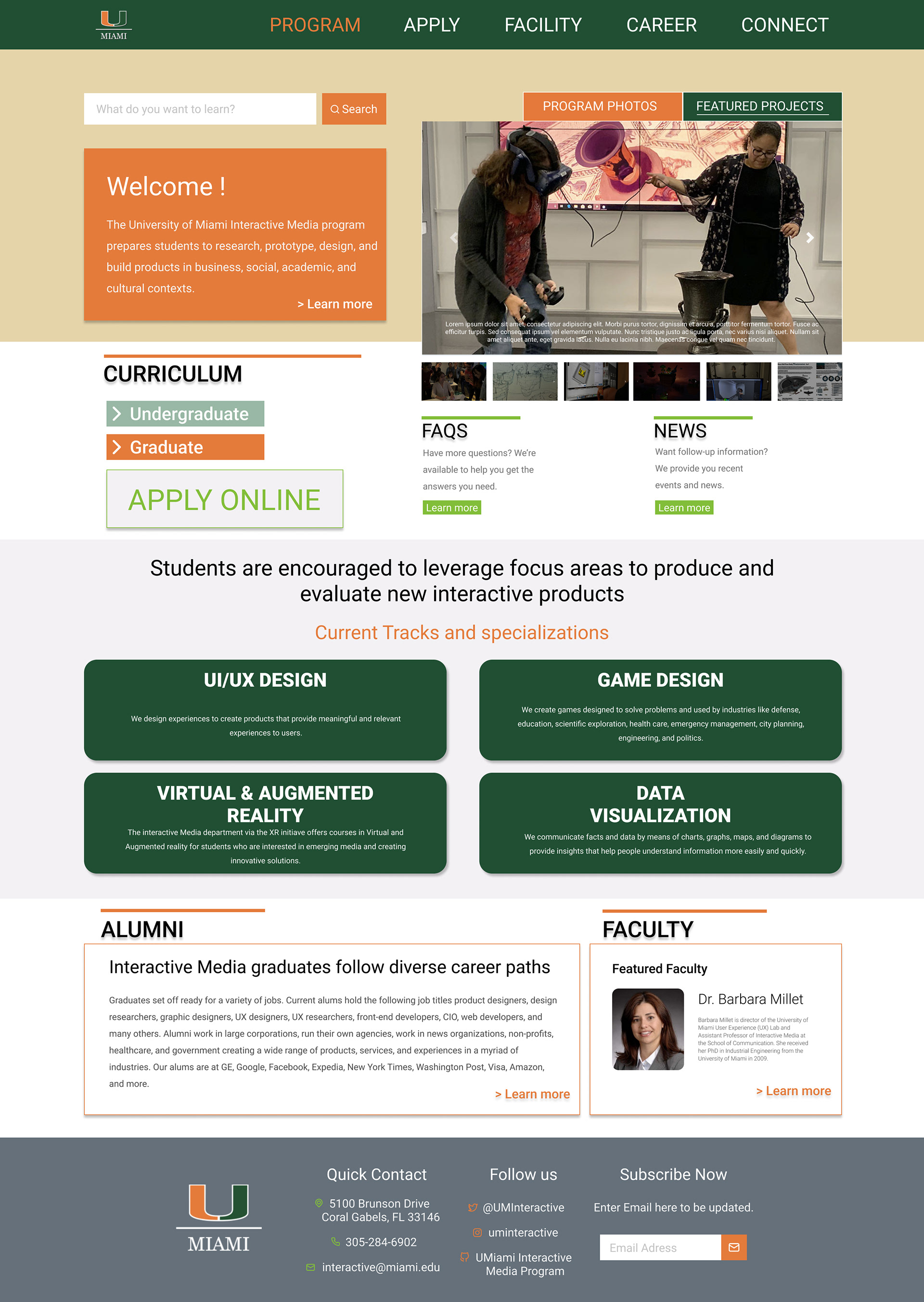
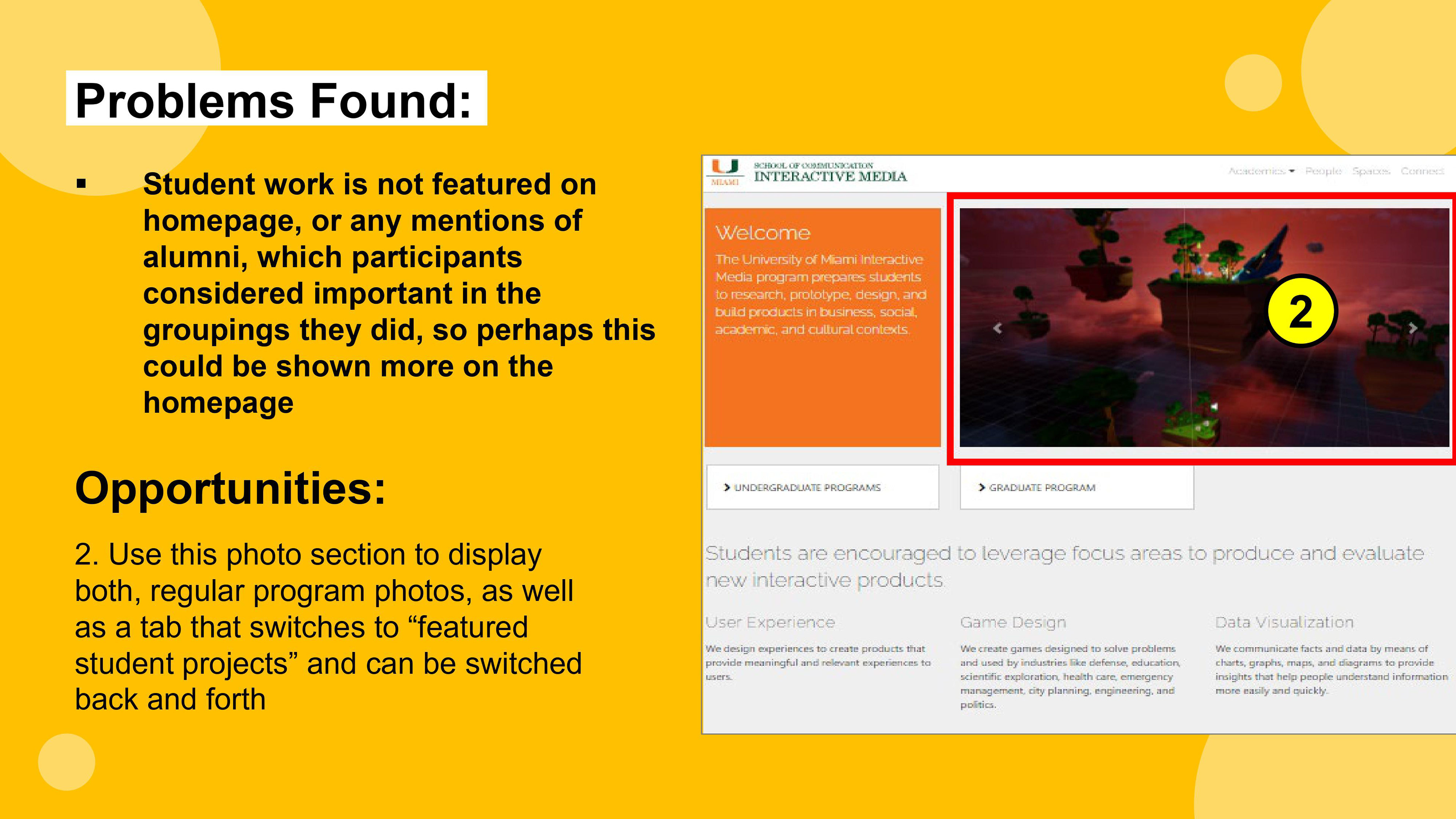
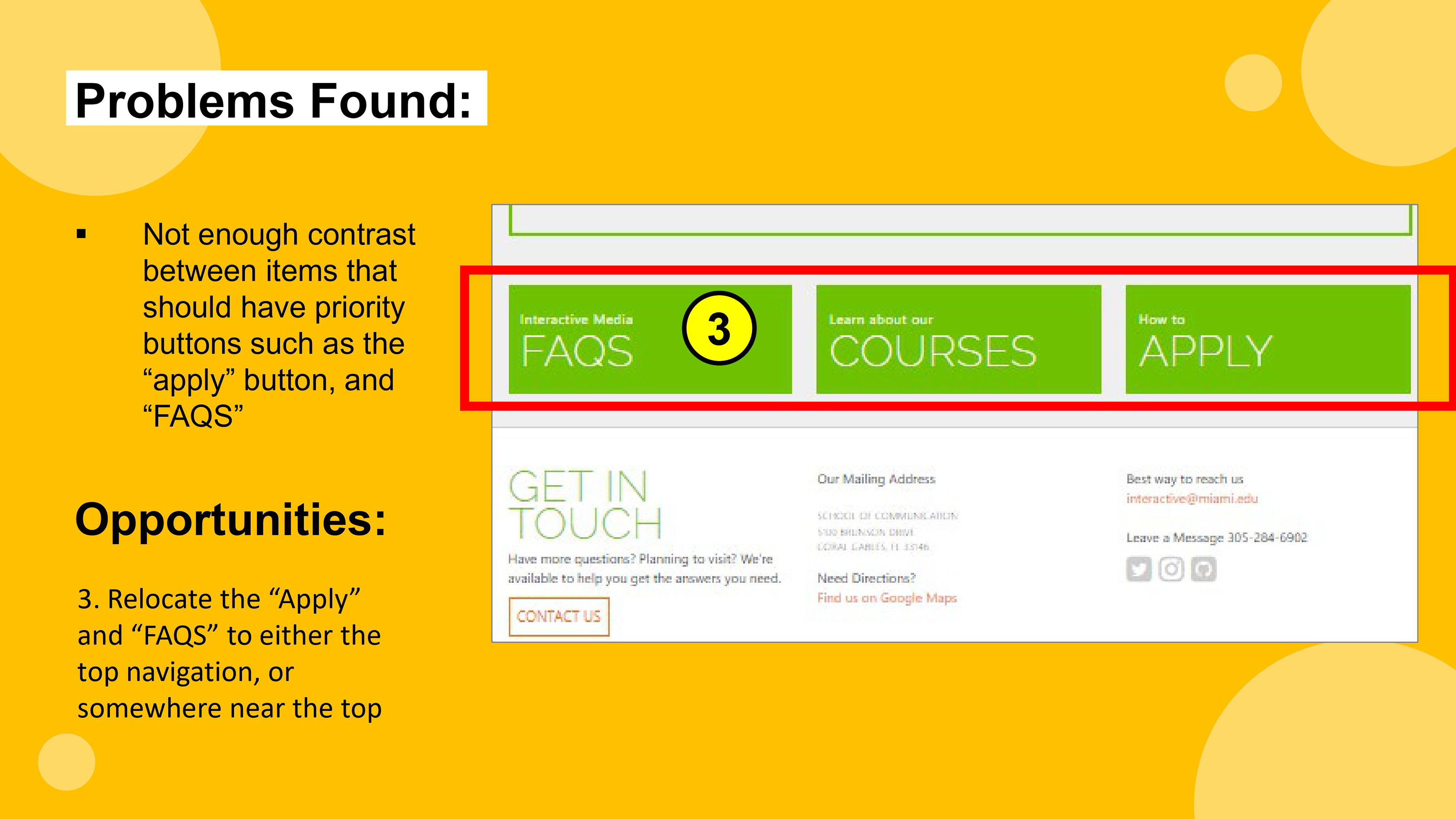
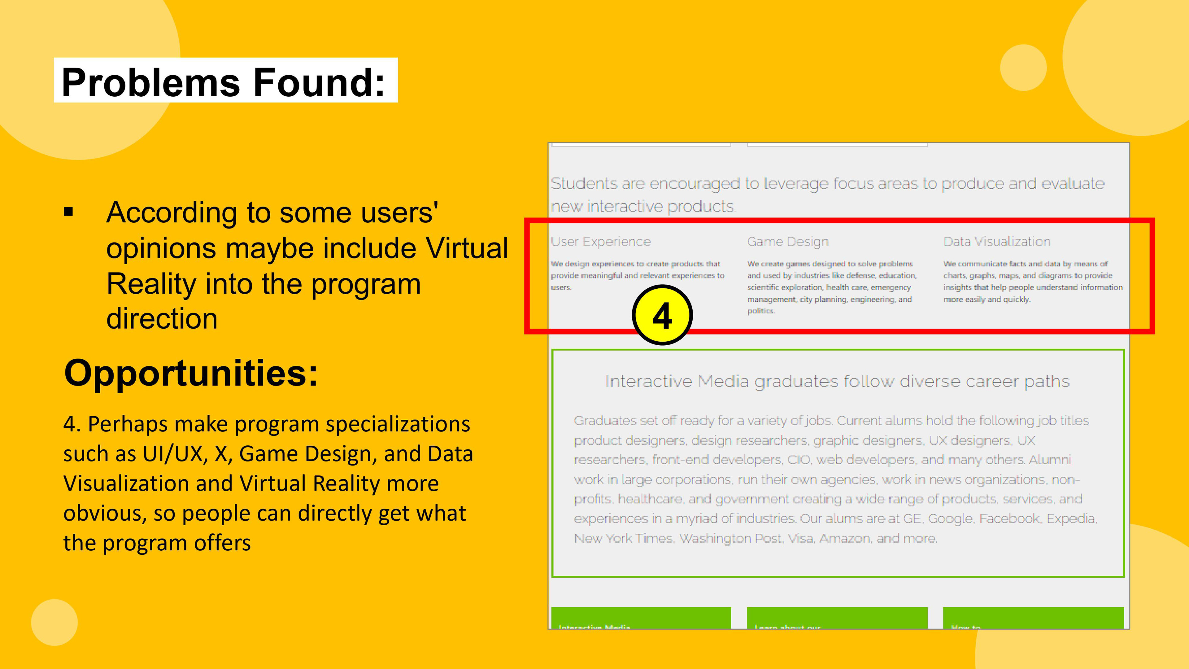
After our analysis and observations, our team was ready to begin the redesign process and offer suggestions. Below you will see our low and high fidelity mockups with our visual solution. One of the most suggested comments from the participants was the inclusion of a featured section with student projects, as well as mentioning the virtual and augmented reality specialization section as one of the tracks the students can follow within the program. In the current website, these two things are not mentioned, and we believe those are missed opportunities for prospective students, who want a more in-depth exploration of the program. One last important comment we received was the inclusion of a "featured faculty" that would randomly alternate each time a user visited the website, that way they could get to know the faculty body and read about them, etc.
Final Redesign
(Low-fi on the left; Hi-fi on the right)
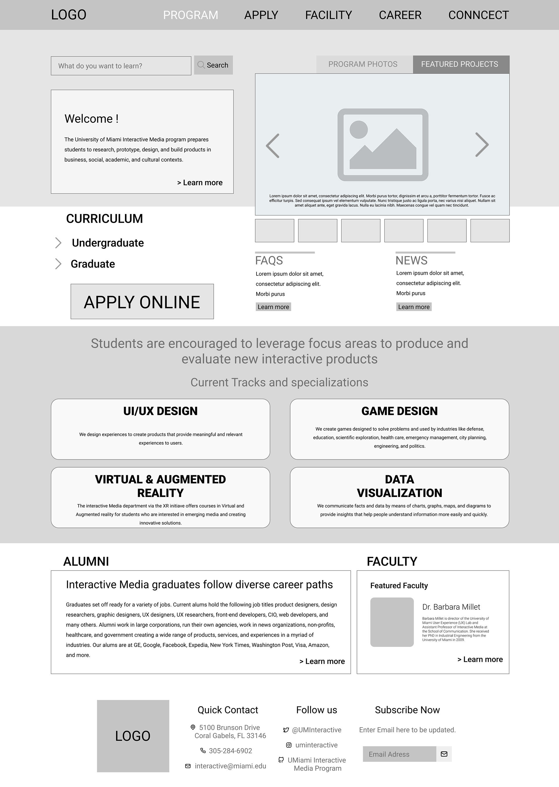
Low-Fidelity Mockup Redesign of UM Interactive Media Home Page by Erik Soriano