MY ROLE:
Developer
UI Designer
PROGRAMMING LANGUAGE:
Dart (via Flutter)
TIMELINE:
2 Week Sprint
Spring 2022
TOOLS:
Flutter
Android Simulator
Adobe Photoshop
App Description:
A fun experience for users who are bored and need a quick laugh in between breaks, and who also love popular culture and memes.
Target Audience:
Millennials and Generation Z users who grew up watching cartoons and are familiar with popular culture and memes. Also, people who enjoy customizing avatars from interactive experiences such as video games or social media avatars.
Features:
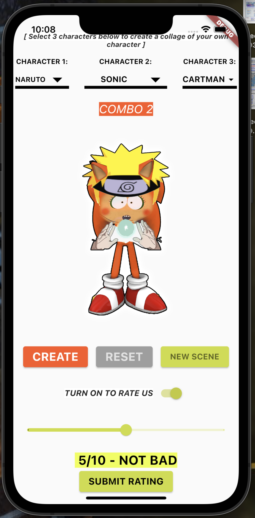
• Allow users to create a custom character using 3 different characters from drop down menus
• Ability to mix and match characters, with every combination giving a different output
• Users can also change the scene (or background) at any time by pressing the “change scene” button, giving them the ability to put their new pop friend into different areas
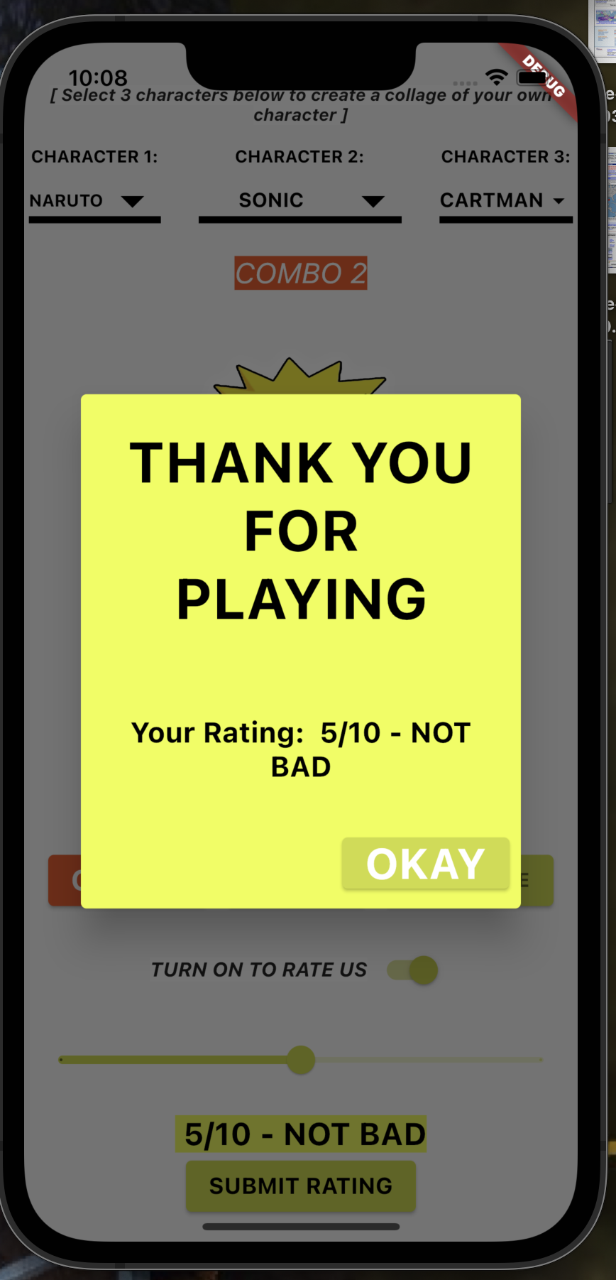
• Users can give a rating of their experience and then submit that rating for developer to measure user enjoyment
Brainstorming + Ideation
I was heavily inspired by character customization within videogames such Zelda: Breath of the Wild, Persona games, etc. I also enjoy memes and pop culture, so this inspired me to come up with this app idea. I always wondered “what would you get if you put Naruto, super mario and spongebob into a blender?; what would be the outcome?”
Well now, if you are like me, you don’t have to wonder any longer, as I have created the outcome for you.
My other app idea was create an application where users can figure out how much money they need in order to buy a home, by calculating down payments, interest rates, etc. but that was too basic and it has been done before — several times — in fact. Once I had my idea down, I pitched it to my professor, who gave me the green light and said it was doable with the limited skillset I possess in dart.
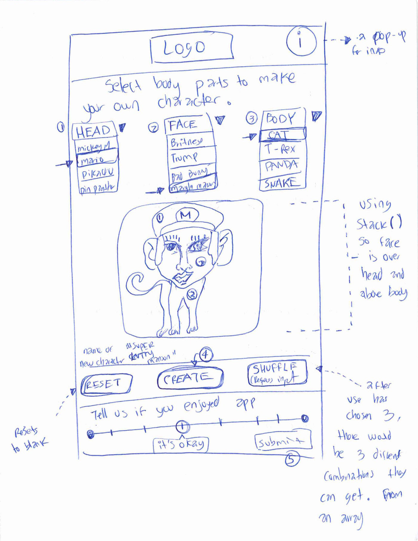
After deciding on page layouts options, I created this rough sketch to use as a blueprint, and for later reference of the beginning phase:
Development + Design
After beginning the development phase, I started by creating all the widgets and necessary components of the interface (i.e., rows, columns, children, containers, etc.). I figured the most intuitive way to organize the main components was a follows:
The (3) dropdown menus:
• Inside a Row( menu1, menu2, menu3)
• The main canvas where photo will output
• Inside a Container(image asset using array[] to invoke)
The action buttons
• Inside another Row(create button; reset button; new scene button)
• I experimented a little but with the button positioning and may consider moving the “create” button to above the photo and right below the 2 dropdown, so when user wants to switch combinations, the button is next to their finger
The rating bar
• There is an optional feature at the bottom, where users can rate the app and then submit their response for the developers to see whether users are enjoying the experience or not.
(The rating bar feature was later dropped because it did not bring any value to the experience, yet. It will be reconsidered at a later iteration)
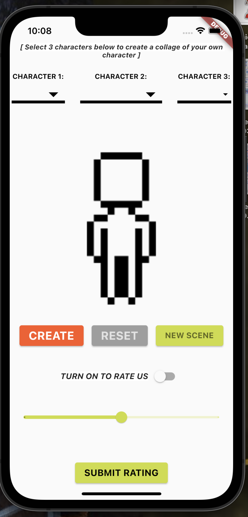
My Pop Friend App - Mobile Programming - First Iteration by Erik Soriano
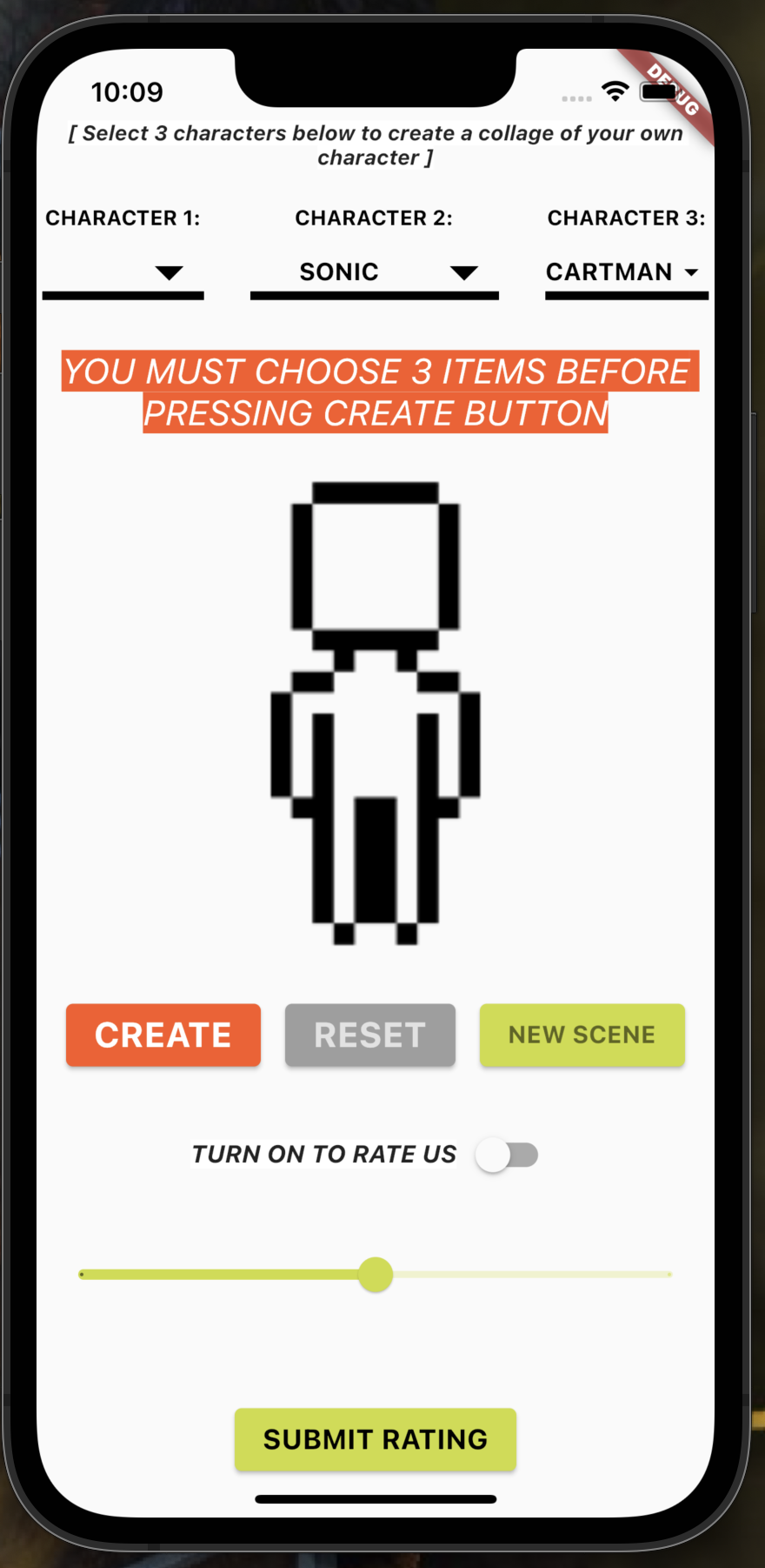
My Pop Friend App - Mobile Programming - First Iteration by Erik Soriano
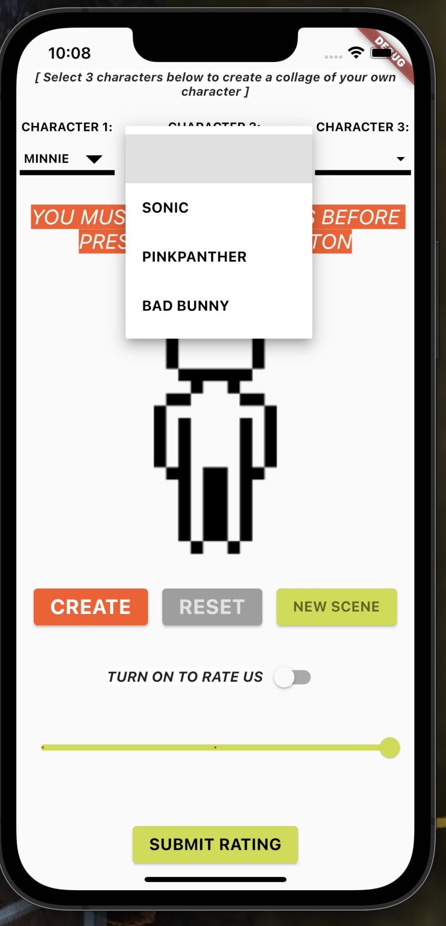
My Pop Friend App - Mobile Programming - First Iteration by Erik Soriano
My Pop Friend App - Mobile Programming - First Iteration by Erik Soriano
My Pop Friend App - Mobile Programming - First Iteration by Erik Soriano
Post-test iterations
and redesign
After testing the app with an initial batch of users, we came to the conclusion that the rating feature was being ignored, and the users who utilized it, said it wasn’t necessary, as it did not lead to anything else. Therefore, we decided to remove it for the time being.
Repositioned Action Buttons:
• The main action button, which is the “CREATE” button, was scaled up to be more prominent and also of a contrasting color
• The secondary action buttons (“new scene”, and “reset”) were recolored to black so that they are visible, and communicate that they work, but were scaled down and moved below the main action button. We realized that in the previous iteration, the “RESET” button was grayed out, and it violated one of the 10 heuristics of usability ; #1 — visibility of system status, and we wanted to ensure the UI was conspicuous and intuitive to the users.
Repositioned photo section and title of character:
• We moved the main photo container above the dropdown menus and buttons, to allow the drop-downs to be closer to user when they click “CREATE”; this ensures the natural path of action the user must follow to generate the output character combination, and since there is more screen real estate now, we made the images a bit larger so they can be appreciated better
• Added the feature to shuffle background scenes:
• Lastly, we added the function to change background scenes randomly every time the user clicks on the “change scene” button. This is also an extra feature, but allows the outputted character to be included in a new setting every time, creating a visual story.